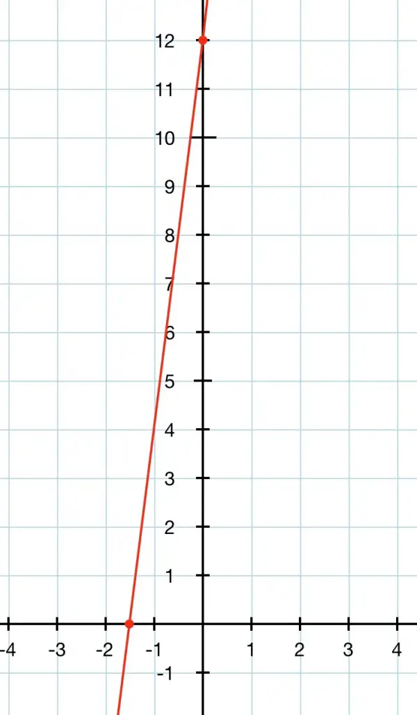
y=8x+12.
To plot the graph is quite easy. The vertical y axis is a number line for the y values and the horizontal x axis is a number line for the x values. Where they meet (the origin) is the zero point for both x and y.
The idea is to find the x and intercepts from the equation. Then we draw a straight line through these intercepts to join them together.
The y intercept is easy to find because it’s the constant in the equation, which is 12. Mark equal intervals on the y axis counting upward from the origin at 0. You will need to mark off at least 12 divisions. Put a cross at 12 on the y axis.
To find the x intercept you make the equation 8x+12=0 and solve for x:
8x=-12, x=-12/8=-3/2=-1½ or -1.5. Negative values on the x axis are to the left of the origin at 0. Mark a few points on the x axis in the negative region counting to the left from zero: -1, -2, -3 and mark the x intercept with a cross halfway between -1 and -2.
You now have two crosses you can draw your line through. That’s it!
It should like something like the picture below. Note that there are divisions to the right of the origin as well as the left on the x axis, and there are divisions below the origin as well as above it on the y axis. The line continues past the intercepts—to infinity in both directions.
Although you have drawn the graph, now we need to look at he practical side of the graph. In the equation, y represents a cost (in whatever currency applies, pounds or dollars, or euros, etc.), and it is a positive quantity. Also, time is measured in hours, the positive divisions on the x axis. So the useful part of the line is to the right of the y axis and above the x axis, and the graph picture above only shows a tiny bit of the red line in this region (quadrant) right at the top. So to use the graph effectively we need to adjust the scales as in the example below. Now it’s easy to read off a number of hours and discover the cost. We have a useful graph by considering carefully what we’re using the graph for. The scales of the two axes are adjusted to fulfil this requirement.
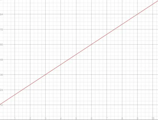
Instead of using the intercepts to draw the line through, you can use any two points on the line to draw through. You can still use the y intercept as one point, and then find another point by choosing an x value and plugging it into the equation to find y. For example, put x=6, so y=8×6+12=60. So mark the point (6,60) and draw through (0,12) and (6,60).